- •
- •
- •
ReWAXation specializes in providing the least painful waxing experience possible for both women and men, as well as providing high quality spray tans. A sense of humor and friendliness make ReWAXation trendy and relatable, with an approachability that sets them apart from other hair removal services.
Currently, there are 3 locations. The flagship spa and second location are in San Francisco, CA, and a third brand new location is now open in Austin, TX. With business pouring in and the new spa opening up in Texas, ReWAXation hired me to give their brand a facelift.
I redesigned and developed the ReWAXation website. The coding was done using HTML, CSS, and a bit of Javascript. Without changing any copy from the prior website, I made the new ReWAXation site more digestible and user friendly. The prior site was not optimized for mobile, so the new design was done with responsiveness in mind.
The goal was to design and develop a website that better matched the ReWAXation brand, while still keeping all of the copy and functionality that the business requires.
Almost 40% of the appointments made by ReWAXation clients are booked through the website. The remaining clients, who book by phone, still require the website to see the services menu, pricing, location and contact information, as well as FAQs. To understand how clients use the ReWAXation site, I booked an appointment through the existing website. I also reviewed all the information provided on the site for a waxing client, and I did online research on each location.
I not only visited and received services at both San Francisco locations, but I also spoke with the employees about what they feel makes ReWAXation a special place for clients as well as an awesome company to work for. I spoke with several clients about why they prefer ReWAXation and what they feel could be improved about the website. I asked them to describe ReWAXation’s brand and how they felt about ReWAXation’s visual identity. It became quickly apparent that the look and feel of the actual salons did not carry over to the website. ReWAXation is relaxed, quirky, comfortable, approachable, trendy, and authentic. It attracts both female and male clients, generally between the ages of 22 and 35, who seek a down-to-earth experience with a spa that cares about its clients. My challenge was to bring that salon identity to a new website.
The original website was hosted through Wix.com, which I have personally used before, so I have knowledge of the pros and cons of the web builder. With ReWAXation’s rapid growth, it was important to move from Wix hosting to a fully coded site that didn’t rely on a builder platform with limited options and high annual costs. Wix’s responsive design options were very limited and glitchy, to the point where it made more sense to just have the desktop site load on mobile. The website redesign needed to not only responsive, but be designed mobile-first.
Many clients were frustrated with the poor readability of the ReWAXation website on both desktop and mobile devices. The use of too many different typefaces, as well as the typefaces chosen, gave the site a hectic feel – the complete opposite of the atmosphere inside the salons. I parred down the typeface choices to two easy-to-read fonts that would be friendly on mobile devices.
As a business providing Waxing, Sugaring and Spray Tanning, ReWAXation is committed to providing excellent pre- and post-care instructions on the FAQ pages. The FAQ pages, however, were hard to digest, mostly because of the typefaces used. By choosing an easy to read typeface, and designing the pages to be mobile responsive, the redesigned FAQ pages were more useful.
The services menu was incredibly difficult to follow on mobile devices, and not particularly user-friendly on desktop devices either. I put mobile first, placing the information in columns that respond to the viewer’s device, simplifying the way the menu was presented visually by eliminating the dotted lines, and adding jump-to links so users could quickly and easily find the service or price they were seeking.

Old Services Page

New Services Page Wireframe
With three different locations (across the country!), the links to Yelp, Facebook, and Google Plus started to look messy and confusing. Additionally, these links were certainly not necessary to have on each page. By neatly organizing the links on the Contact page, and prioritizing the “Call” option for each location, pages were instantly simplified, and the social media links became immediately digestible and easy to follow.

Old Contact Page
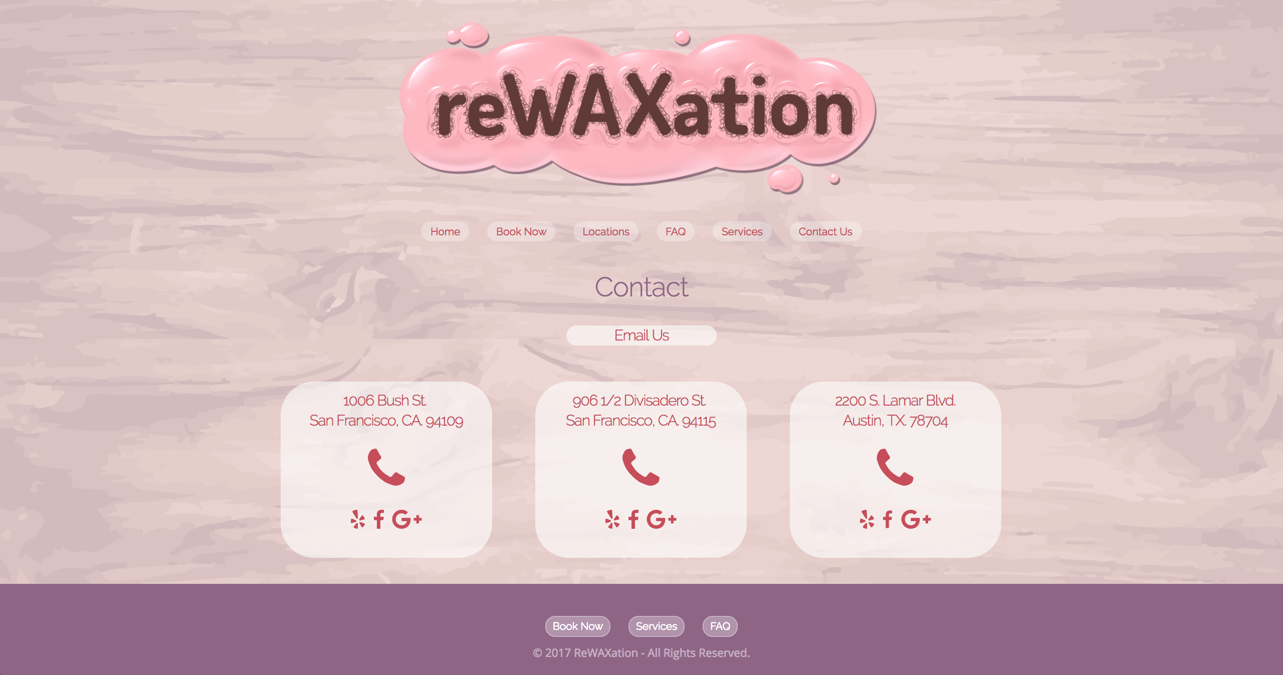
New Contact Page
One key differentiator of the ReWAXation brand is their signature pink wax. Most waxing businesses have two options for waxing clients: Hard wax and soft wax. They each have their pros and cons, but Shayana, the owner of ReWAXation, saw the potential to create a wax that provided the pros of both hard and soft wax, while eliminating the cons of both options. ReWAXation Spa boasts a proprietary self-hardening but flexible pink wax that lifts both thick and thin hairs, without lifting the skin or requiring the use of strips. Shayana wanted this wax to be incorporated into their logo in an authentic way, so I redesigned their logo, staying true to the ReWAXation brand their clients know and love. It shows off their special wax in a *ahem* unique way! I also did huge hand-painted wooden signs for two of their three locations, read more about that work in the second part of this case study.

Old Logo
New Logo
The two locations where I painted murals have purple walls with pink signage, so I chose purple text to go with the pink logo. Although a large majority of the ReWAXation clients are female, I created a more neutral background to ensure I didn’t alienate male clients. The wood texture mimics the wood used for the interior walls of the San Francisco spa locations.
I did an in-depth user study which immediately gave me a lot of information to work with. While the simplified screenshots are less intimidating, I am having second thoughts. There could have been a better way to show screenshots of the site while not overpowering the list of features. If I were to revisit this project, that would be one of the first things I would reconsider.
Overall, this project was a great learning experience regarding the benefits of in-depth user research to drive extensive refinement. I believe having so many options for the landing page sections was a good move. I was able to ask the opinions of potential users and narrow down the most solid designs.
Going forward, I will take the same editing eye and continue to refine my designs based on detailed user research and reap the benefits of creating multiple iterations for user testing.
